Envision
A visual programming IDE for object-oriented languages
Classes | Functions | Variables
Visualization Namespace Reference

The VisualizationBase plug-in sets the foundations of the visualization framework in Envision. More...

Classes

class  AnchorLayoutAnchor
 An anchor is a constraint on how two elements are positioned relative to each other along one axis. More...
 
class  AnchorLayoutConstraintSolver
 This class can solve the linear program given by a list of elements and anchors. More...
 
class  AnchorLayoutFormElement
 
class  ArrowOverlay
 An overlay to draw an arrow from the first item to the second item. More...
 
class  ArrowOverlayStyle
 
class  BorderFormElement
 The border form element is a placeholder form element that can be used to make Anchor Layouts stretchable. More...
 
class  Box
 
class  BoxOverlay
 
class  BoxOverlayStyle
 
class  BoxStyle
 
class  BoxTest
 
class  Braces
 
class  BracesStyle
 
class  CompositeTest
 
class  Cursor
 
class  CursorShapeItem
 
class  CustomSceneEvent
 
class  DeclarativeItem
 The DeclarativeItem class is the base class for all items that use the declarative API for visualizations. More...
 
class  DeclarativeItemBase
 The non-template base class for DeclarativeItem. More...
 
class  DeclarativeItemBaseStyle
 
class  DeclarativeTest
 
class  DeclarativeTestStyle
 
class  Diamond
 
class  DiamondStyle
 
class  DynamicGridFormElement
 
class  ElementCache
 Class to cache information about an element, that varies form item to item. More...
 
class  EmptyItem
 A stretchable item which is empty and can be used to draw a shape. More...
 
class  FormElement
 Base class for all the form elements, that can be added as a form to a DeclarativeItem. More...
 
class  Frame
 
class  FrameStyle
 
class  FullDetailSize
 
class  GridLayout
 
class  GridLayouter
 
class  GridLayoutFormElement
 This class allows the arrangement of elements in a grid. More...
 
class  GridLayoutStyle
 
class  HighlightOverlay
 
class  HighlightOverlayStyle
 
class  Icon
 
class  IconOverlay
 
class  IconOverlayStyle
 
class  IconStyle
 
class  InfoJavascriptFunctions
 
class  InfoNode
 An InfoNode is the base class of all nodes which display some sort of information on a target node. More...
 
class  InteractionHandler
 
class  Item
 
class  ItemRegion
 
class  ItemStyle
 
class  ItemWithNode
 
class  ItemWrapperFormElement
 Base class for an element wrapping an item. More...
 
class  Layout
 
class  LayoutCursor
 
class  LayoutFormElement
 Base class for a layout element. More...
 
class  LayoutProvider
 
class  LayoutProviderBase
 
class  LayoutStyle
 
class  Line
 
class  LineStyle
 
class  MainView
 
struct  MajorMinorIndex
 
class  MessageOverlay
 
class  MessageOverlayStyle
 
class  MiniMap
 
class  Mipmap
 
class  ModelRenderer
 
class  NodeItemWrapperFormElement
 This is an item wrapper element, with a specifiable node to create the item with. More...
 
class  NodeWithVisualizationItemWrapperFormElement
 This is an item wrapper element, with a specifiable style for the wrapped item, and a node to create the item with. More...
 
class  NodeWrapper
 This class can be used to display nodes with their default style, but wrapped in an item, which can be given an ItemStyle. More...
 
class  Overlay
 
class  OverlayAccessor
 
class  OverlayAccessorTemplate
 
class  OverlayAccessorTemplateWithDeleter
 
class  OverlayGroup
 
class  Position
 
class  PositionLayout
 
class  PositionLayoutStyle
 
class  RootItem
 
class  Scene
 
class  SceneHandlerItem
 
class  SelectionOverlay
 
class  SequentialLayout
 
class  SequentialLayoutFormElement
 The sequential layout element can display a list of items either horizontally or vertically. More...
 
class  SequentialLayoutStyle
 
class  Shape
 
class  ShapeFormElement
 The shape form element is a placeholder form element, stretching to encompass all the available space. More...
 
class  ShapeStyle
 
class  Static
 
class  StaticSequenceStyle
 
class  StaticStyle
 
class  Style
 
class  StyleLoader
 
class  StyleNode
 
class  StyleProperty
 
class  StyleProperty< T, typename std::enable_if< std::is_enum< T >::value >::type >
 
class  StyleProperty< T, typename std::enable_if< std::is_integral< T >::value >::type >
 
class  StyleSet
 
class  SuperFormElement
 
class  SuperLayoutElement
 
class  SVGIcon
 
class  SVGIconStyle
 
class  SvgShape
 
class  SvgShapeStyle
 
class  Symbol
 
class  SymbolStyle
 
class  SzLevelOrderingManager
 
class  TestBox
 
class  TestBoxNode
 
class  Text
 
class  TextCursor
 
class  TextRenderer
 
class  TextStyle
 
class  UINode
 
class  UpdateSceneEvent
 
class  VBoolean
 
class  VCharacter
 
class  VComposite
 
class  VCompositeStyle
 
class  VFloat
 
class  View
 
class  ViewItem
 The ViewItem class represents the visualization of an entire view within a single item. More...
 
class  ViewItemManager
 The ViewItemManager manages all the different ViewItems which are part of a given scene. More...
 
class  ViewItemNode
 The ViewItemNode class is used in the ViewItem class and simply wraps a top level node to give another level of indirection. More...
 
class  VInfoNode
 
class  VInteger
 
class  VisualizationAddOn
 
class  VisualizationBasePlugin
 
class  VisualizationException
 
class  VisualizationGroup
 
class  VisualizationGroupsManager
 
class  VisualizationItemWrapperFormElement
 This is an item wrapper element, with a specifiable style for the wrapped item. More...
 
struct  VisualizationItemWrapperFormElementSyncMethod
 
struct  VisualizationItemWrapperFormElementSyncMethod< ChildItem, Style, true >
 
class  VisualizationManager
 
class  VisualizationSuitabilityScore
 
class  VList
 
class  VListStyle
 
class  VReference
 
class  VText
 
class  VUsedLibrary
 
class  VUsedLibraryStyle
 
class  VViewItemNode
 The VVIewItemNode class visualizes a ViewItemNode, either by visualizing its reference if it exists, or else rendering an empty item for spacing. More...
 
class  WebBrowserItem
 
class  ZoomLabelOverlay
 

Functions

void clearAllStyleSets ()
 
template<typename VIS , typename NODE >
ItemcreateVisualization (Item *parent, Model::Node *node)
 
 DEFINE_TYPE_ID_DERIVED (ArrowOverlay, "ArrowOverlay",) void ArrowOverlay
 
 DEFINE_TYPE_ID_DERIVED (Box, "Box",) void Box
 
 DEFINE_TYPE_ID_DERIVED (BoxOverlay, "BoxOverlay",) void BoxOverlay
 
 DEFINE_TYPE_ID_DERIVED (BoxTest, "BoxTest",) void BoxTest
 
 DEFINE_TYPE_ID_DERIVED (Braces, "Braces",) void Braces
 
 DEFINE_TYPE_ID_DERIVED (CursorShapeItem, "CursorShapeItem",) void CursorShapeItem
 
 DEFINE_TYPE_ID_DERIVED (DeclarativeItemBase, "DeclarativeItemBase",) void DeclarativeItemBase
 
 DEFINE_TYPE_ID_DERIVED (DeclarativeTest, "DeclarativeTest",) void DeclarativeTest
 
 DEFINE_TYPE_ID_DERIVED (Diamond, "Diamond",) void Diamond
 
 DEFINE_TYPE_ID_DERIVED (EmptyItem, "EmptyItem",) void EmptyItem
 
 DEFINE_TYPE_ID_DERIVED (Frame, "Frame",) void Frame
 
 DEFINE_TYPE_ID_DERIVED (GridLayout, "GridLayout",) void GridLayout
 
 DEFINE_TYPE_ID_DERIVED (HighlightOverlay, "HighlightOverlay",) void HighlightOverlay
 
 DEFINE_TYPE_ID_DERIVED (Icon, "Icon",) void Icon
 
 DEFINE_TYPE_ID_DERIVED (IconOverlay, "IconOverlay",) void IconOverlay
 
 DEFINE_TYPE_ID_DERIVED (Layout, "Layout",) void Layout
 
 DEFINE_TYPE_ID_DERIVED (LayoutProviderBase, "LayoutProviderBase",) void LayoutProviderBase
 
 DEFINE_TYPE_ID_DERIVED (Line, "Line",) void Line
 
 DEFINE_TYPE_ID_DERIVED (MessageOverlay, "MessageOverlay",) void MessageOverlay
 
 DEFINE_TYPE_ID_DERIVED (NodeWrapper, "NodeWrapper",) void NodeWrapper
 
 DEFINE_TYPE_ID_DERIVED (PositionLayout, "PositionLayout",) void PositionLayout
 
 DEFINE_TYPE_ID_DERIVED (RootItem, "RootItem",) void RootItem
 
 DEFINE_TYPE_ID_DERIVED (SceneHandlerItem, "SceneHandlerItem",) void SceneHandlerItem
 
 DEFINE_TYPE_ID_DERIVED (SelectionOverlay, "SelectionOverlay",) void SelectionOverlay
 
 DEFINE_TYPE_ID_DERIVED (SequentialLayout, "SequentialLayout",) void SequentialLayout
 
 DEFINE_TYPE_ID_DERIVED (Static, "Static",) void Static
 
 DEFINE_TYPE_ID_DERIVED (SVGIcon, "SVGIcon",) void SVGIcon
 
 DEFINE_TYPE_ID_DERIVED (SvgShape, "SvgShape",) void SvgShape
 
 DEFINE_TYPE_ID_DERIVED (Symbol, "Symbol",) void Symbol
 
 DEFINE_TYPE_ID_DERIVED (TestBox, "TestBox",) void TestBox
 
 DEFINE_TYPE_ID_DERIVED (Text, "Text",) void Text
 
 DEFINE_TYPE_ID_DERIVED (TextRenderer, "TextRenderer",) void TextRenderer
 
 DEFINE_TYPE_ID_DERIVED (VBoolean, "VBoolean",) void VBoolean
 
 DEFINE_TYPE_ID_DERIVED (VCharacter, "VCharacter",) void VCharacter
 
 DEFINE_TYPE_ID_DERIVED (VComposite, "VComposite",) void VComposite
 
 DEFINE_TYPE_ID_DERIVED (VFloat, "VFloat",) void VFloat
 
 DEFINE_TYPE_ID_DERIVED (ViewItem, "ViewItem",) void ViewItem
 
 DEFINE_TYPE_ID_DERIVED (VInfoNode, "VInfoNode",) void VInfoNode
 
 DEFINE_TYPE_ID_DERIVED (VInteger, "VInteger",) void VInteger
 
 DEFINE_TYPE_ID_DERIVED (VList, "VList",) void VList
 
 DEFINE_TYPE_ID_DERIVED (VReference, "VReference",) void VReference
 
 DEFINE_TYPE_ID_DERIVED (VText, "VText",) void VText
 
 DEFINE_TYPE_ID_DERIVED (VUsedLibrary, "VUsedLibrary",) void VUsedLibrary
 
 DEFINE_TYPE_ID_DERIVED (VViewItemNode, "VViewItemNode",) void VViewItemNode
 
 DEFINE_TYPE_ID_DERIVED (WebBrowserItem, "WebBrowserItem",) void WebBrowserItem
 
 DEFINE_TYPE_ID_DERIVED (ZoomLabelOverlay, "ZoomLabelOverlay",) void ZoomLabelOverlay
 
bool operator< (const QPair< VisualizationSuitabilityScore, QPair< int, VisualizationGroup::ItemConstructor >> &left, const QPair< VisualizationSuitabilityScore, QPair< int, VisualizationGroup::ItemConstructor >> &right)
 
bool operator< (const VisualizationSuitabilityScore &left, const VisualizationSuitabilityScore &right)
 
template<typename T >
void SAFE_DELETE_ITEM (T *&&item)
 Do not make this a non-template function since then the reference to pointer won't work as it is not polymorphic. More...
 
template<typename T >
void SAFE_DELETE_ITEM (T *&item)
 Do not make this a non-template function since then the reference to pointer won't work as it is not polymorphic. More...
 
template<typename T >
void SAFE_DELETE_ITEM (T *const &item)
 Do not make this a non-template function since then the reference to pointer won't work as it is not polymorphic. More...
 

Variables

constexpr bool ENABLE_AUTOMATIC_SEMANTIC_ZOOM = false
 
constexpr int FULL_DECLARATION_ABSTRACTION_SEMANTIC_ZOOM_LEVEL = 5
 
static constexpr int MAX_CURSOR_JUMP_DISTANCE = 1500
 
QList< QMap< QString, Style * > * > styleSetMaps_
 
const QString XML_DOM_TYPE = "EnvisionVisualizationStyle"
 

Detailed Description

The VisualizationBase plug-in sets the foundations of the visualization framework in Envision.

Envision's visualization framework is based on Qt's GraphicsView framework. In that framework a QGraphicsScene is a virtual canvas where QGraphicsItem objects are drawn. A QGraphicsView is used to visualize the scene or parts of it.

VisualizationBase defines classes built upon the functionality of the Graphics View framework to provide essential features for visualizing and navigating application trees. A number of extensibility concepts are also implemented which make it easy to add custom functionality.

Scenes

A Scene is a data structure that contains the visual representation of one or more trees and possibly other graphical entities. It is a virtual canvas that is not visible itself but serves as the source for one or more views. Objects on this canvas are instances of Item or derived classes. Items which are part of an application tree visualization are structured in a hierarchy similar to the one of the tree. Other graphical objects can have an arbitrary structure.

A Scene has an associated ModelRenderer which is used to construct a visualization (instance of Item) from an arbitrary node in a tree. Classes deriving from Item which represent a node must be registered with a ModelRenderer indicating what node type they can depict. The renderer is then used to draw visualizations of a tree or of individual nodes. It is possible to have multiple renderers and switch between them in order to use different sets of visualizations.

The scene accepts user input events from associated views and propagates them to the appropriate item (e.g. the item under the cursor or the focused item). Each scene also has a default SceneHandlerItem. User actions which are not processed by any other item on the scene will be forwarded to this object. Default interaction mechanisms can be implemented there. The scene is automatically updated after the user interacts with any of its associated views.

Items on the scene need to be updated whenever a change in the application tree or in a visual representation occurs. In order to avoid unnecessary updates which are costly this process has been optimized to only adjust affected visual elements. The mechanism relies on the hierarchy of items on the scene. Whenever the visualization of an item becomes invalid, only it and all of its ancestors will be updated. Siblings which explicitly indicate that their visualization depends on the one of their parent, may also be updated.

Views

To display the contents of a scene a View widget must be placed on the main screen of Envision. Multiple views can be used to show the same scene from different viewpoints simultaneously. Views can visualize the scene using a variety of transformations such as scaling, rotation and translation. Views support zooming in and out, moving to different parts of the scene and also provide scene interaction.

A view can be either a master view (i.e. has no parent) or a child view which must specify a parent view. The position and size on screen of child views are controlled by their parent. Master views are managed by the VisualizationManager singleton. It is responsible for positioning and resizing the views within Envision's main window.

VisualizationBase provides a default view. The MainView master view provides two distinct features: a fixed step zoom behavior controlled by the mouse wheel and a mini map navigation. The mini map navigation is implemented in the child view MiniMap which at all times shows the entire scene and outlines in red the region currently displayed by its parent. The user can navigate the main view by clicking or dragging within the mini map located in the lower left corner.

The figure below shows a screen shot of the two views. Here only part of the canvas is visible and the mini map helps the user to stay oriented.

Mini-map example

Items

A central concept in VisualizationBase is the item. Items are the building blocks of the visualizations in Envision. An item belongs to a scene and can draw anything on it: text, shapes, images, etc. Items can also have child items thus allowing a natural hierarchical structure.

Items in Envision inherit from the Item class. It implements facilities to configure the geometry of an item, to perform updates, to communicate with the scene, to process input events and to handle the item's style and shape. Subclasses are responsible for specifying what should be drawn and what children, if any, an item has.

Generally items are used to visualize nodes from the application tree. Some items directly correspond to a node (inherit from ItemWithNode), while others perform service functions in the visualization. For example a method item corresponds to a construct from the application tree. Other items, such as icons, layouts, lines, connectors, etc. might be part of a method's visualization but are only used to achieve a certain look and are not directly associated with a node. Typically one of the ancestors of these items is an ItemWithNode.

Each item has a style. A style is a collection of properties which define how an item should be drawn. This could include for example, a color scheme for the item, positions for children items, a style for children items and others. Styles allow for the customization of most aspects of the visualization without the need to understand or modify program source code, therefore simplifying the task of experimenting with different appearances.

The developer of a subclass of Item decides what visualization parameters the new class should contain. During the construction of an Item or at a later time a particular style can be set that defines the values of all required properties. VisualizationBase provides a convenient way of instantiating styles based on XML files. Defining a specific look and feel in such a way is very flexible: the files provide reuse mechanisms which make it easy to create a family of styles that have a common base. This flexibility is granular and can be applied to an entire set of properties or singe parameters. Using this built-in mechanism provided by the singleton Styles a single style object will be shared among all items which share the same properties. The format of style files and more details on how to use them are discussed below.

Specified in each item's style is an optional shape. A Shape is a static image drawn behind the item, such as for example a box. By default the item's content is fully enclosed by the shape and appears on top of it, but this behavior can be overridden if desired. Changing the appearance of the shape or even substituting a shape for another one can be achieved easily by modifying the item's style file. A shape itself has properties which are also defined there. Shapes already defined in VisualizationBase include a Box, a Diamond, Braces, and SvgShape.

Interaction

Interaction with the scene is performed at the item level. When the user presses a key on the keyboard, moves the mouse or clicks a mouse button, a corresponding event is sent to the scene which then dispatches it to the appropriate Item object. This is for example the top-most visible object under the cursor or the focused item for keyboard events.

An item can either handle or ignore an event. By default all keyboard and most mouse events are ignored. An ignored mouse event is propagated to the the next visible item under the current one. Some basic selection behavior is enabled for all items. All default mechanisms are provided by Qt.

VisualizationBase also introduces a command handling mechanism for all items. Each item can receive a string command and execute it. The exact mechanism is specified in InteractionBase, VisualizationBase only provides the necessary infrastructure.

To enable more advanced item interaction, event and command processing for each item is performed by an InteractionHandler object. Such an object is associated with each item class. The default implementation simply ignores commands and forwards events to the underlying Qt event handling methods. Plug-in developers can create new handlers and replace the default one in order to allow custom interaction. A handler can override the behavior for mouse, keyboard and command events. InteractionBase provides a GenericHandler which implements many useful functions.

Predefined items

A number of items which are frequently used in visualizations are provided for convenience by VisualizationBase:

TextRenderer - This is an abstract item that can be used to render any Unicode string on screen. Any other item which has an inherent textual representation can inherit from TextRenderer and use the facilities it provides which include text selection and modification (in conjunction with an appropriate interaction handler). This is suitable for literals, identifiers, keywords, comments, special symbols, etc. TextRenderer supports a rich style definition, that allows the configuration of the font, size, mode, color and background in both the normal and the selected state.

Text - A thin wrapper around TextRenderer that just renders some text on screen. The text to display can be set at run-time and may optionally be editable.

Symbol - An item that renders static text on screen. The text to render is determined by the style file of the item. This is useful for defining the visualization of ’fixed’ items, such as unary and binary operator symbols, keywords, etc.

LayoutProvider - This item makes it easy to design a new visualization based on a layout. Typically a client will inherit from LayoutProvider specifying a particular layout to use. LayoutProvider will automatically take care of all drawing and service functions and the derived class must only populate the layout with children elements.

SVGIcon - This item displays the content of an SVG file as an icon. The file to use and the icon size are specified in the item's style.

VBoolean, VCharacter, VInteger, VFloat, VText, VReference, VList, VComposite - As a convention item names of the form Vnode are used when they visualize the correspondingly named node. Thus these items are used to show the similarly named nodes defined in ModelBase. Most of these items are thin wrappers around TextRenderer. VList uses a SequentialLayout and shows the contents of a List object. VComposite serves as a generic visualization for any class deriving from CompositeNode. It lists all the attributes of such an item as a pair of attribute name and attribute visualization per row.

The figure below is a screen shot from Envision showing how some of the predefined items are visualized.

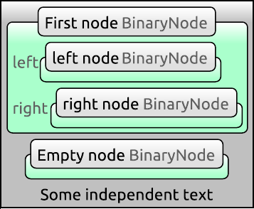
The default visualization of generic items

The figure shows a list with a gray background which consists of three items. The first two items are VComposite objects representing a simple BinaryNode node. The last item is a VText object rendering of a Text node. A binary node has a name, and optionally a left and right child nodes. VComposite shows all attributes of the node it represents as a vertical list of pairs. In gray we see on the left the name of the attribute. On the right we see the visualization of the attribute value. Since VComposite can be used to visualize any node that inherits from CompositeNode there needs to be away to know exactly what node type is being visualized. The name of the node type appears in gray in the top bar of the visualization. In case there is an attribute called name VComposite puts this in the title before the type name, instead of the normal list of attributes. Thus in the image above the first two elements of the list are called 'First node' and 'Empty node'. Furthermore we see that both child elements of 'First node' are present and are called 'left node' and 'right node'. All instances of VComposite represent BinaryNode objects as indicated by their type in gray text.

Layouts

Layouts are items whose only purpose is to contain other items and manage their position on screen. A composite item can use one or several layouts to simplify the management of children. For example the visualization of a node representing a class can contain a layout that displays all of the class' methods in a linear sequence, or in a grid.

Several common layouts are provided by VisualizationBase. Most of the options that control aspects of their visualizations are configurable in styles. Only more interesting options will are mentioned below.

SequentialLayout - This layout arranges its children items in a linear sequence. Its interface is similar to a collection, items can be inserted and removed anywhere in the layout. The way the items are visualized depends on the layout's style and includes options for ordering, orientation, alignment and spacing. The figure below shows four instances of a sequential layout visualizing the same items ( A, B and C) with different style settings.

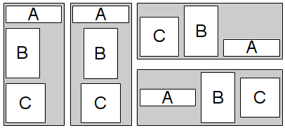
A sequential layout with different orientations, item orderings and alignments.

This layout is useful for arranging objects which logically belong to an ordered sequence, such as the statements of a method.

GridLayout - Items in this layout are arranged in a grid as demonstrated on the figure below. It is possible to adjust the horizontal and vertical alignment of items as well as the space between them. For maximum convenience it is possible to have empty grid spaces.

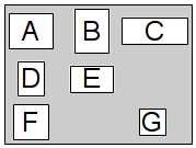
A grid layout where the contained items are horizontally and vertically centered. Not all grid positions are filled.

This layout can be used to show a group of items more concisely compared to a SequentialLayout. Some constructs such as matrices are also naturally represented by a grid arrangement.

PositionLayout - This layout arranges items which contain a position. Visualizations which can be used in this layout must represents nodes that have the Position extension. This extension class is defined in VisualizationBase and can be registered for any node type that inherits from CompositeNode. It provides x and y coordinates that define the position of the node. The figure below shows an example visualization of three items.

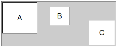
A position layout. The location of each item is determined from its x and y coordinates stored in the application model.

This layout is suitable for the rendering of unordered sets or lists, such as a collection of classes or methods.

Styles

Each visual item in Envision has a style, which is a set of properties that define how the item should be drawn. The values of these properties are defined by a style file. A sample file is shown below:

<!DOCTYPE EnvisionVisualizationStyle>
<style prototypes="item/Item/default">
   <shape prototypes="shape/Box/default">
      Box
      <backgroundBrush>
         <gradient>
            <stopPoints>
               <e1>
                  <first>1.0</first>
                  <second>
                     <alpha>255</alpha>
                     <red>192</red>
                     <green>192</green>
                     <blue>192</blue>
                  </second>
               </e1> 
            </stopPoints>
         </gradient>
      </backgroundBrush>
      <cornerType>0</cornerType>
      <cornerRadius>5</cornerRadius>
   </shape>
   <itemsStyle prototypes="layout/SequentialLayout/default">
      <direction>2</direction>
      <spaceBetweenElements>5</spaceBetweenElements>
   </itemsStyle>
</style>

The root element is always called style. The tags of its child elements are the names of the properties whose value needs to be defined. A value can be a simple text, boolean, number or a composite style that itself consists of other values. The meaning of these properties is defined by the style class.

Each property may have one or more prototypes defined using the prototypes attribute. A prototype is a style file. This enables a specialization scheme for composite properties. When such a property has at least one prototype, it is not necessary to explicitly specify all of its sub-elements. The value of any elements that are not specified will be taken from the first prototype in the prototype list that has a definition for this value.

In the example above the entire style uses a prototype - the default Item style. This is a common practice as the default item style specifies properties which each item must define such as a shape. Afterwards two properties are defined - shape and itemsStyle. The shape property overrides the one from the default item style and specifies that a box shape will be used. This shape has many properties which are not explicitly specified here, therefore the shape's default style is used as a prototype. Only the sub-properties of the shape that differ from the prototype are defined in the current style file. This is essentially the second color of the background gradient, the corner type and the corner radius. The other property - itemsStyle - defines the direction and the space between elements of the underlying sequential layout that is used within VList to display its content. Any other properties that the sequential layout style requires are taken from the default prototype.

Multiple prototype entries in the prototypes attribute can be specified by using a comma. The paths specified there can be either relative to the current file, or can begin in the 'styles' folder of a deployed Envision installation.

Function Documentation

◆ clearAllStyleSets()

void Visualization::clearAllStyleSets ( )

◆ createVisualization()

template<typename VIS , typename NODE >
Item* Visualization::createVisualization ( Item parent,
Model::Node node 
)

◆ DEFINE_TYPE_ID_DERIVED() [1/46]

Visualization::DEFINE_TYPE_ID_DERIVED ( ArrowOverlay  ,
"ArrowOverlay"   
)

◆ DEFINE_TYPE_ID_DERIVED() [2/46]

Visualization::DEFINE_TYPE_ID_DERIVED ( Box  ,
"Box"   
)

◆ DEFINE_TYPE_ID_DERIVED() [3/46]

Visualization::DEFINE_TYPE_ID_DERIVED ( BoxOverlay  ,
"BoxOverlay"   
)

◆ DEFINE_TYPE_ID_DERIVED() [4/46]

Visualization::DEFINE_TYPE_ID_DERIVED ( BoxTest  ,
"BoxTest"   
)

◆ DEFINE_TYPE_ID_DERIVED() [5/46]

Visualization::DEFINE_TYPE_ID_DERIVED ( Braces  ,
"Braces"   
)

◆ DEFINE_TYPE_ID_DERIVED() [6/46]

Visualization::DEFINE_TYPE_ID_DERIVED ( CursorShapeItem  ,
"CursorShapeItem"   
)

◆ DEFINE_TYPE_ID_DERIVED() [7/46]

Visualization::DEFINE_TYPE_ID_DERIVED ( DeclarativeItemBase  ,
"DeclarativeItemBase"   
)

◆ DEFINE_TYPE_ID_DERIVED() [8/46]

Visualization::DEFINE_TYPE_ID_DERIVED ( DeclarativeTest  ,
"DeclarativeTest"   
)

◆ DEFINE_TYPE_ID_DERIVED() [9/46]

Visualization::DEFINE_TYPE_ID_DERIVED ( Diamond  ,
"Diamond"   
)

◆ DEFINE_TYPE_ID_DERIVED() [10/46]

Visualization::DEFINE_TYPE_ID_DERIVED ( EmptyItem  ,
"EmptyItem"   
)

◆ DEFINE_TYPE_ID_DERIVED() [11/46]

Visualization::DEFINE_TYPE_ID_DERIVED ( Frame  ,
"Frame"   
)

◆ DEFINE_TYPE_ID_DERIVED() [12/46]

Visualization::DEFINE_TYPE_ID_DERIVED ( GridLayout  ,
"GridLayout"   
)

◆ DEFINE_TYPE_ID_DERIVED() [13/46]

Visualization::DEFINE_TYPE_ID_DERIVED ( HighlightOverlay  ,
"HighlightOverlay"   
)

◆ DEFINE_TYPE_ID_DERIVED() [14/46]

Visualization::DEFINE_TYPE_ID_DERIVED ( Icon  ,
"Icon"   
)

◆ DEFINE_TYPE_ID_DERIVED() [15/46]

Visualization::DEFINE_TYPE_ID_DERIVED ( IconOverlay  ,
"IconOverlay"   
)

◆ DEFINE_TYPE_ID_DERIVED() [16/46]

Visualization::DEFINE_TYPE_ID_DERIVED ( Layout  ,
"Layout"   
)

◆ DEFINE_TYPE_ID_DERIVED() [17/46]

Visualization::DEFINE_TYPE_ID_DERIVED ( LayoutProviderBase  ,
"LayoutProviderBase"   
)

◆ DEFINE_TYPE_ID_DERIVED() [18/46]

Visualization::DEFINE_TYPE_ID_DERIVED ( Line  ,
"Line"   
)

◆ DEFINE_TYPE_ID_DERIVED() [19/46]

Visualization::DEFINE_TYPE_ID_DERIVED ( MessageOverlay  ,
"MessageOverlay"   
)

◆ DEFINE_TYPE_ID_DERIVED() [20/46]

Visualization::DEFINE_TYPE_ID_DERIVED ( NodeWrapper  ,
"NodeWrapper"   
)

◆ DEFINE_TYPE_ID_DERIVED() [21/46]

Visualization::DEFINE_TYPE_ID_DERIVED ( PositionLayout  ,
"PositionLayout"   
)

◆ DEFINE_TYPE_ID_DERIVED() [22/46]

Visualization::DEFINE_TYPE_ID_DERIVED ( RootItem  ,
"RootItem"   
)

◆ DEFINE_TYPE_ID_DERIVED() [23/46]

Visualization::DEFINE_TYPE_ID_DERIVED ( SceneHandlerItem  ,
"SceneHandlerItem"   
)

◆ DEFINE_TYPE_ID_DERIVED() [24/46]

Visualization::DEFINE_TYPE_ID_DERIVED ( SelectionOverlay  ,
"SelectionOverlay"   
)

◆ DEFINE_TYPE_ID_DERIVED() [25/46]

Visualization::DEFINE_TYPE_ID_DERIVED ( SequentialLayout  ,
"SequentialLayout"   
)

◆ DEFINE_TYPE_ID_DERIVED() [26/46]

Visualization::DEFINE_TYPE_ID_DERIVED ( Static  ,
"Static"   
)

◆ DEFINE_TYPE_ID_DERIVED() [27/46]

Visualization::DEFINE_TYPE_ID_DERIVED ( SVGIcon  ,
"SVGIcon"   
)

◆ DEFINE_TYPE_ID_DERIVED() [28/46]

Visualization::DEFINE_TYPE_ID_DERIVED ( SvgShape  ,
"SvgShape"   
)

◆ DEFINE_TYPE_ID_DERIVED() [29/46]

Visualization::DEFINE_TYPE_ID_DERIVED ( Symbol  ,
"Symbol"   
)

◆ DEFINE_TYPE_ID_DERIVED() [30/46]

Visualization::DEFINE_TYPE_ID_DERIVED ( TestBox  ,
"TestBox"   
)

◆ DEFINE_TYPE_ID_DERIVED() [31/46]

Visualization::DEFINE_TYPE_ID_DERIVED ( Text  ,
"Text"   
)

◆ DEFINE_TYPE_ID_DERIVED() [32/46]

Visualization::DEFINE_TYPE_ID_DERIVED ( TextRenderer  ,
"TextRenderer"   
)

◆ DEFINE_TYPE_ID_DERIVED() [33/46]

Visualization::DEFINE_TYPE_ID_DERIVED ( VBoolean  ,
"VBoolean"   
)

◆ DEFINE_TYPE_ID_DERIVED() [34/46]

Visualization::DEFINE_TYPE_ID_DERIVED ( VCharacter  ,
"VCharacter"   
)

◆ DEFINE_TYPE_ID_DERIVED() [35/46]

Visualization::DEFINE_TYPE_ID_DERIVED ( VComposite  ,
"VComposite"   
)

◆ DEFINE_TYPE_ID_DERIVED() [36/46]

Visualization::DEFINE_TYPE_ID_DERIVED ( VFloat  ,
"VFloat"   
)

◆ DEFINE_TYPE_ID_DERIVED() [37/46]

Visualization::DEFINE_TYPE_ID_DERIVED ( ViewItem  ,
"ViewItem"   
)

◆ DEFINE_TYPE_ID_DERIVED() [38/46]

Visualization::DEFINE_TYPE_ID_DERIVED ( VInfoNode  ,
"VInfoNode"   
)

◆ DEFINE_TYPE_ID_DERIVED() [39/46]

Visualization::DEFINE_TYPE_ID_DERIVED ( VInteger  ,
"VInteger"   
)

◆ DEFINE_TYPE_ID_DERIVED() [40/46]

Visualization::DEFINE_TYPE_ID_DERIVED ( VList  ,
"VList"   
)

◆ DEFINE_TYPE_ID_DERIVED() [41/46]

Visualization::DEFINE_TYPE_ID_DERIVED ( VReference  ,
"VReference"   
)

◆ DEFINE_TYPE_ID_DERIVED() [42/46]

Visualization::DEFINE_TYPE_ID_DERIVED ( VText  ,
"VText"   
)

◆ DEFINE_TYPE_ID_DERIVED() [43/46]

Visualization::DEFINE_TYPE_ID_DERIVED ( VUsedLibrary  ,
"VUsedLibrary"   
)

◆ DEFINE_TYPE_ID_DERIVED() [44/46]

Visualization::DEFINE_TYPE_ID_DERIVED ( VViewItemNode  ,
"VViewItemNode"   
)

◆ DEFINE_TYPE_ID_DERIVED() [45/46]

Visualization::DEFINE_TYPE_ID_DERIVED ( WebBrowserItem  ,
"WebBrowserItem"   
)

◆ DEFINE_TYPE_ID_DERIVED() [46/46]

Visualization::DEFINE_TYPE_ID_DERIVED ( ZoomLabelOverlay  ,
"ZoomLabelOverlay"   
)

◆ operator<() [1/2]

bool Visualization::operator< ( const QPair< VisualizationSuitabilityScore, QPair< int, VisualizationGroup::ItemConstructor >> &  left,
const QPair< VisualizationSuitabilityScore, QPair< int, VisualizationGroup::ItemConstructor >> &  right 
)

◆ operator<() [2/2]

bool Visualization::operator< ( const VisualizationSuitabilityScore left,
const VisualizationSuitabilityScore right 
)

◆ SAFE_DELETE_ITEM() [1/3]

template<typename T >
void Visualization::SAFE_DELETE_ITEM ( T *&&  item)
inline

Do not make this a non-template function since then the reference to pointer won't work as it is not polymorphic.

◆ SAFE_DELETE_ITEM() [2/3]

template<typename T >
void Visualization::SAFE_DELETE_ITEM ( T *&  item)
inline

Do not make this a non-template function since then the reference to pointer won't work as it is not polymorphic.

◆ SAFE_DELETE_ITEM() [3/3]

template<typename T >
void Visualization::SAFE_DELETE_ITEM ( T *const &  item)
inline

Do not make this a non-template function since then the reference to pointer won't work as it is not polymorphic.

Variable Documentation

◆ ENABLE_AUTOMATIC_SEMANTIC_ZOOM

constexpr bool Visualization::ENABLE_AUTOMATIC_SEMANTIC_ZOOM = false
constexpr

◆ FULL_DECLARATION_ABSTRACTION_SEMANTIC_ZOOM_LEVEL

constexpr int Visualization::FULL_DECLARATION_ABSTRACTION_SEMANTIC_ZOOM_LEVEL = 5
constexpr

◆ MAX_CURSOR_JUMP_DISTANCE

constexpr int Visualization::MAX_CURSOR_JUMP_DISTANCE = 1500
staticconstexpr

◆ styleSetMaps_

QList< QMap< QString, Style * > * > Visualization::styleSetMaps_

◆ XML_DOM_TYPE

const QString Visualization::XML_DOM_TYPE = "EnvisionVisualizationStyle"